
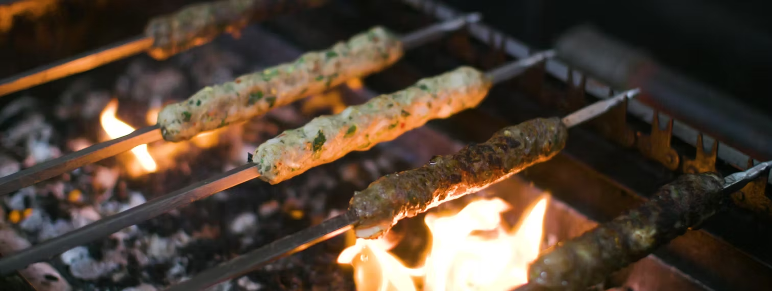
There is a strange moment in every restaurant website project where you realise the menu is not the hardest part, because the harder job is making the page feel like the place. A restaurant has noise, pace, warmth, smell, movement and small signals of hospitality, while a website has to carry that feeling through a screen; before working with Web Development Malta, our site had information, but it did not really carry the feeling of Shimlas Oldham.
That mattered more than we first admitted, because people often decide whether to visit a restaurant before they read much. They look at the food, the room, the confidence of the page, the way buttons are named, the speed with which they can book or order, and whether the place feels alive, so if the website feels flat, the restaurant has to work harder later to correct that impression.
Design is a form of hospitality
The agency's strongest point was that they did not treat design as decoration, but talked about it as hospitality by asking what a visitor should feel first, what should be obvious within five seconds, where the eye should go after the hero image, and whether the page invited someone to book a table, order food or simply understand the restaurant better.
That changed the whole tone of the project. We stopped asking whether a section looked nice in isolation and started asking whether it helped a guest make a decision; the homepage needed appetite, the navigation needed restraint, the photography needed enough room to breathe, and the copy needed to sound confident without becoming theatrical.
I appreciated that they were willing to be opinionated, because restaurant websites can become cluttered very quickly with too many offers, too many boxes, too many competing messages, and too many stock phrases about passion and flavour. They kept cutting the page back to the essentials: show the room, show the food, make the next step obvious, and let the brand feel generous, not busy.
The food needed presence, not noise
Shimlas is not a quiet brand: the food is bold, the grills have colour, the curries have depth, and the restaurant experience is built around sharing, but translating that into web design is delicate. Too much visual drama can make a restaurant feel cheaper than it is, while too little can make it feel generic.
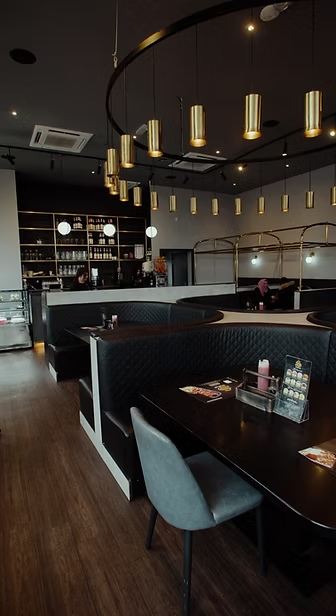
The design work found a middle ground: dark backgrounds gave the food more contrast, gold accents added warmth without taking over, and large images were used where they mattered instead of being scattered everywhere. The result felt closer to how people actually experience the restaurant: warm, confident, full of flavour, but still controlled.
That restraint was important because a restaurant website should make someone hungry, but it should also make them trust the place. A beautiful dish means less if the booking path is awkward or the page feels careless, so the design had to carry appetite and competence at the same time.
The practical parts became easier
Good design also made the practical jobs simpler, because booking a table, ordering food, checking contact details and understanding the services all became easier to find. That may sound basic, but basic is where many restaurant websites lose people.
We liked how the structure separated different visitor moods. Someone who wants dinner tonight can move quickly, someone browsing the restaurant can enjoy the imagery, and someone planning a group meal can find the contact route, so the same site can serve all three without feeling like three different websites stitched together.
The biggest improvement was clarity, with the website beginning to feel less like a folder of pages and more like a guided first impression that had a beginning, a rhythm and a sense of priority.
What I would keep from the process
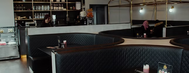
The part I valued most was the way Web Development Malta listened to the business behind the design. They were not trying to make a restaurant website that could belong to anyone. They were trying to understand what made Shimlas feel like Shimlas: the darker room, the rich food photography, the confidence of the menu, the sense that people come here to share a proper meal.
That is why the finished site felt more personal: it did not invent a new identity for us, but sharpened the one we already had.
If I had to describe the result in one sentence, I would say this: the website finally started doing what the front door does, giving people a feeling before it gave them information, which for a restaurant is not a small thing.